Scaling ToolTime's design system

Context
ToolTime’s design system was built on a static color palette and inconsistent naming across design and code. This made it hard to roll out product-wide visual updates, especially branding changes.
When a white-label partner needed a fully rebranded UI, it exposed the core issue: our system wasn’t built for theming.
My role
Product designer
Time frame
Jun – Dec 2023
Team
- 1 Product manager
- 2 Engineers
- 1 Product designer (me)
Key results
7-figure annual recurring revenue
through a successful white-label launch
Design team owns visual updates
no more engineering dependency for color, typography or branding changes
Reduced designer-engineer friction
thanks to a shared, semantic token system
Opportunity
The white-label requirement revealed a critical gap: our design system couldn’t support theming at scale.
I used this as a chance to move to semantic tokens that aligned design and code. This would let us support white-labeling now while building a foundation for future partners and features as well as improving our visual consistency.
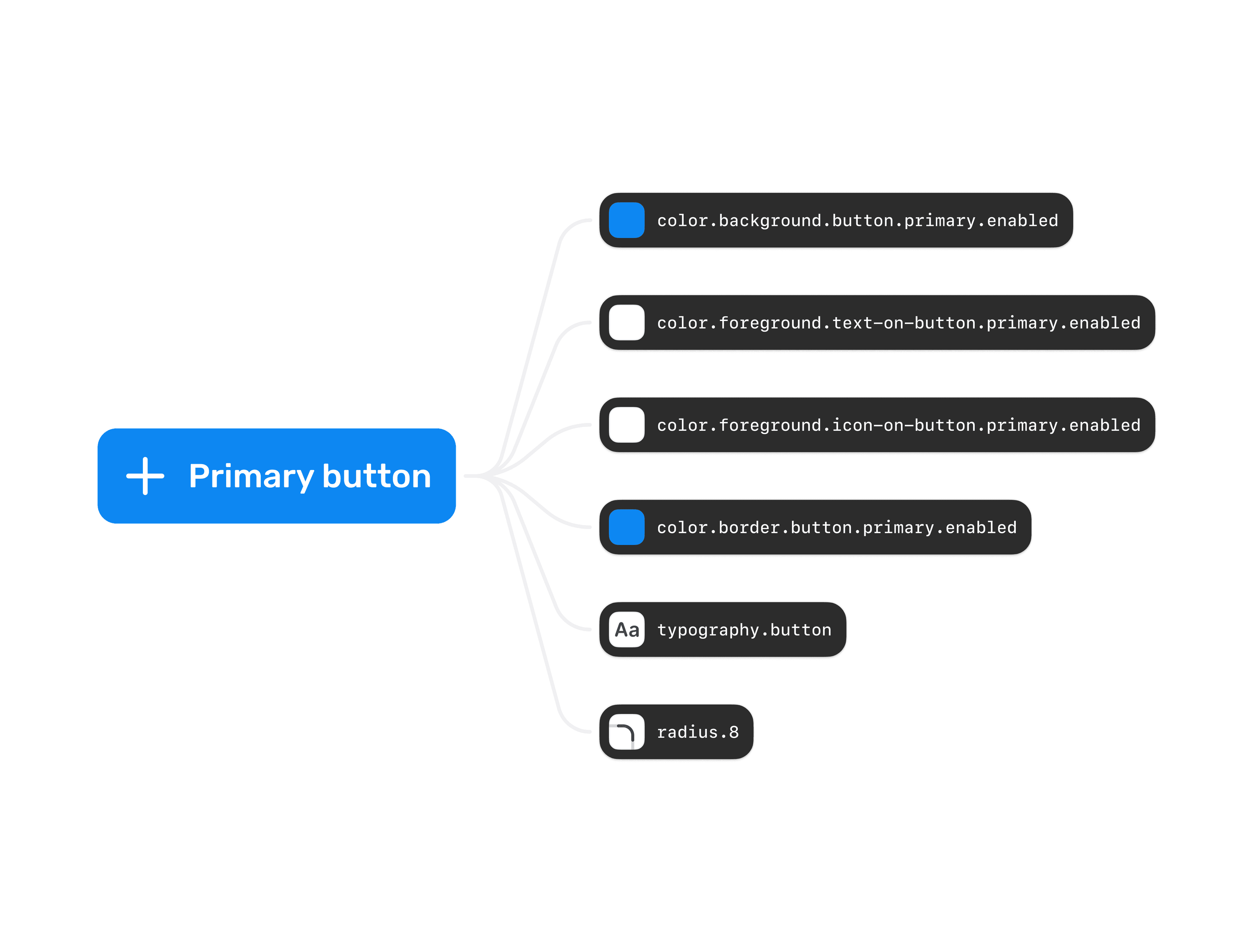
Re-architecting the color system
One of the biggest challenges was rethinking how colors were applied across our design system. I transitioned from static palette references to a tokenized color system, mapping raw colors to semantic tokens for text colors, borders, shadows and more.
This abstraction allowed us to define and switch between brand-specific themes instantly, ensuring consistency across all components.
Designers push tokens, engineers pull packages
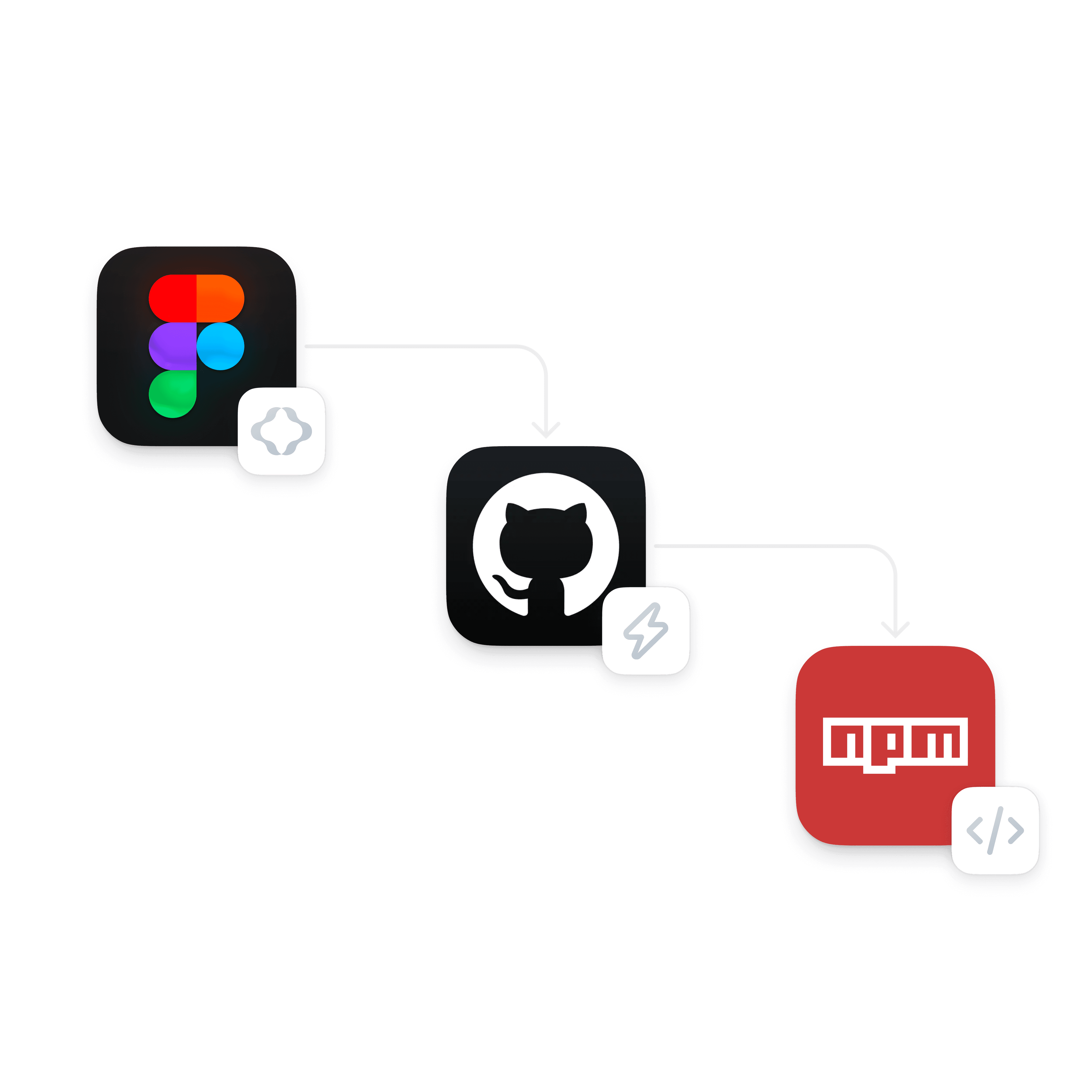
To close the gap between design and development, I proposed using Figma Tokens (now Tokens Studio) because it integrates with GitHub.
After testing the workflow with an engineer, we confirmed:
- It could sync token updates safely to GitHub
- Engineers could consume updates as an npm package
- Designers had full ownership, no more waiting for an engineer
Built tooling so the team would actually use it
Rolling out a new system is only half the job. Adoption is the other half. To support the team, I:
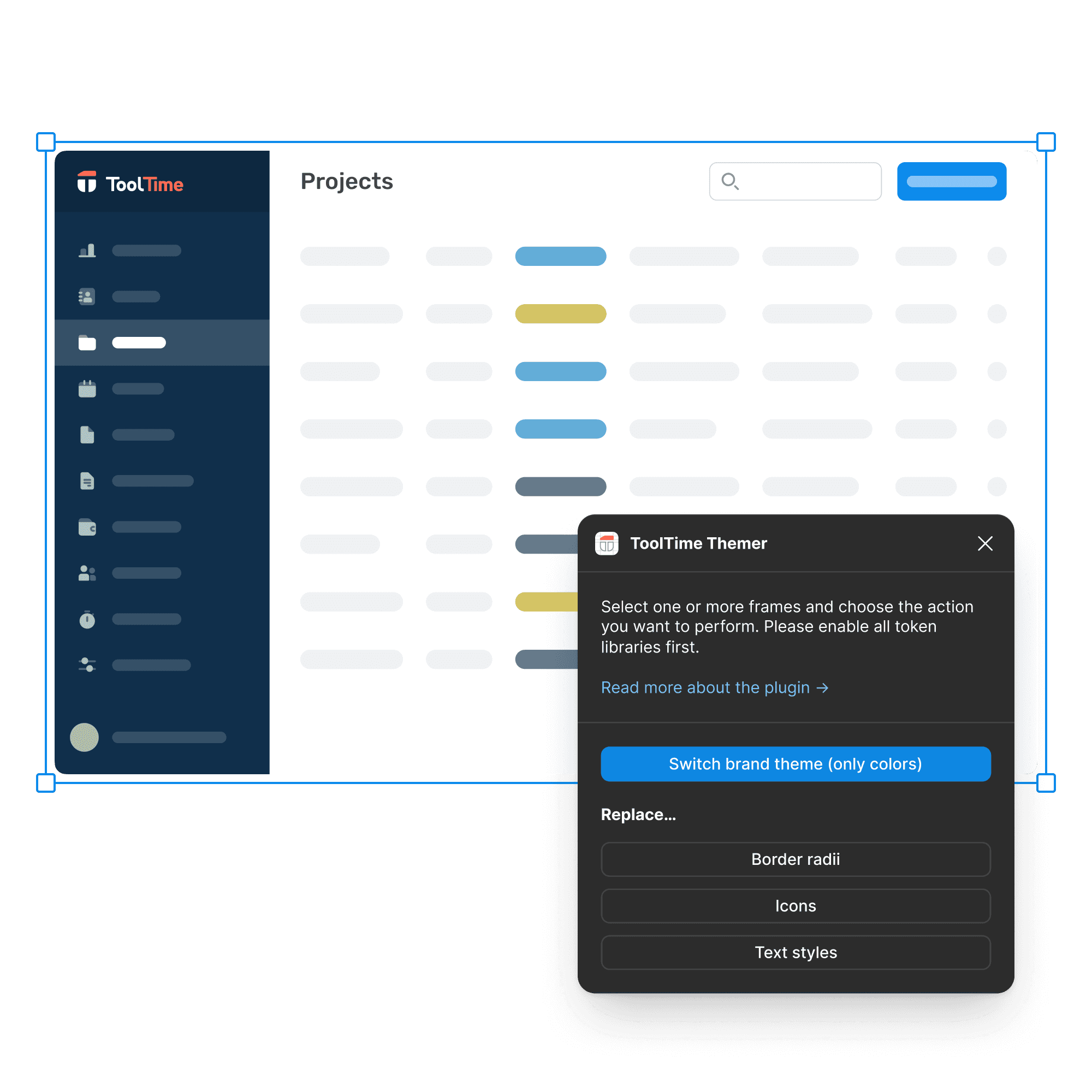
Built a Figma plugin
That let designers theme screens in seconds (before Figma supported variables)
Wrote documentation
To help designers and engineers understand how to use tokens
Ran training sessions
To onboard the team and gather feedback from teams using tokens
These efforts removed friction and helped the team confidently adopt the new system.

Hands-on with frontend, not just handoff
I worked directly in the codebase with engineers, helping apply tokens to components. This hands-on collaboration made the rollout smoother and showed me exactly where I needed to refine the system.
Reflection
I used to think naming tokens would be the hardest part. Turns out, the real challenge was making the system easy enough that everyone actually wanted to use it.
This project taught me that successful design systems aren’t just about structure: they’re about adoption. The best solution wasn’t the most technical one, but the one both designers and engineers could understand, trust and maintain together.
It pushed me to think beyond Figma files and into workflows, habits and team dynamics. That's what made it work.